
Last week Zirous attended Technology Association of Iowa’s 2026 Iowa Technology…
It’s hard to imagine living through a global pandemic. Yet here we are. Some individuals choose not to have it deter their life and scheduled plans, others claim it’s fake, some isolate themselves and their family, and some don’t have a choice and are under government mandated shelter-in-place or quarantine. The thought of living through this time feels like something you would see in a science fiction novel or movie. It’s hard to grasp the fact that our advanced society, infrastructure, and modern medicine is ill-equipped and ill-prepared for such events. This unprecedented time has truly shown how fragile our society can be and how quick we are to accept early information or misinformation as fact. Is there a lesson to be learned from all this? I sure hope so.
Early Misinformation
Let’s look back at the early onset of the global pandemic and reaction to see how quickly and dangerously misinformation can be adopted and spread. Do we all recall the media and some of our friends or colleagues touting the facts that the current virus only has a 2% death rate? Not any more than the common seasonal flu. According to the National Center of Health Statistics Mortality Surveillance System, the state of New York tragically suffered 167 deaths and 179 deaths due to pneumonia and influenza during week 9 and week 10 of 2020. respectively. To put this into context, at the time of this blog, the state of New York has reported nearly 1,000 deaths in a week due to COVID-19. New York City alone had 161 deaths in one night due to COVID-19.
The below infographic was presented by a local news network in Hartford, CT, on March 6, 2020, and stated “that the flu can be considered a much bigger issue than the coronavirus.”
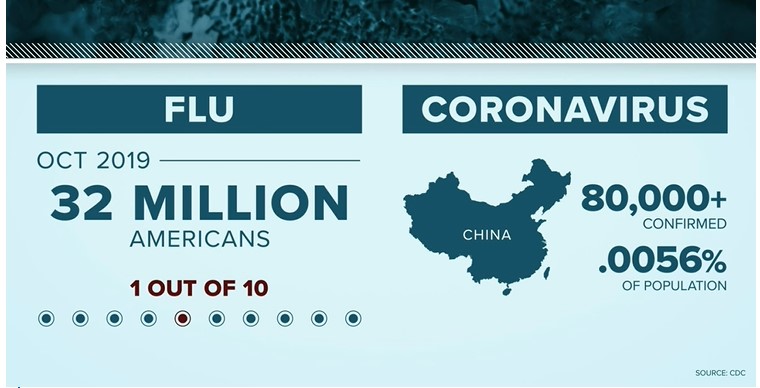
What do the above graphic and numbers tell us? That on average, 32 million Americans have the flu, or 10% of the country’s population, while the COVID-19 virus has 80,000 cases in China, which is far less than 1% of the country’s population. Does the above graphic really scare anyone? I can empathetically agree with the majority who answer no. But when I look at the graphic, it’s just offering me averages and percentages of those who became infected, nothing more and nothing less. We simply don’t have enough information to draw any conclusion. Does this tell you the severity of the virus? Does this offer you the background information and fear the WHO and CDC shared about this current virus?
The late Chinese whistleblower Li Wenliang was notifying the local public back on December 30, 2019. The World Health Organization (WHO) was notified and aware of the virus spread into Thailand on January 11, 2020. Within 2 weeks, the virus had travelled across borders. And in another four days it had spread to Japan. However, this isn’t the information the public latches onto or what the media reports. The media’s goal is to provide incredibly condensed information in a short period of time. The last thing we should do with this information is take it as unequivocal truth. It is our responsibility to understand what is presented — understand how to interpret the data presented to us — and formulate our own opinion.
Develop an Understanding
Data literacy and context is a fundamental requirement to build insight. When you are provided new information, you need to analyze what is presented and begin formulating questions:
Develop an understanding:
- What is this new virus?
- Who is contracting the virus?
- What is the growth rate?
- What is the contact rate?
- How do these rates vary among different groups of people?
- How do they vary among different countries with different response measures?
Build Insights
Once you can answer the early questions from the new information, you begin to formulate more advanced questions:
- How long is the symptomatic period?
- How long is the infectious period?
- How does it affect people who are older/younger than me? Does age matter?
- Does overall health matter, and if so, how?
- Are other countries’ citizens infected?
- Can you compare that data with China and create a baseline?
You will continue going through this cycle of reviewing data, analyzing and formulating new questions. We need to move beyond reviewing data as averages and looking for correlations where they may not yet exist. The data — and our analysis of it — should leave no question unanswered for ourselves, our families, our coworkers, and more.
Assess Data Quality
As you review and assess data, one key factor to keep in mind is the quality of the data in use. In the previous data shown for New York it appears the death rate is quite high compared to infection rate. Have you considered the volume of tests per capita? One challenge in the US and elsewhere is the availability of testing. In some areas (like Iowa) only the very sick are receiving testing. This may skew your analysis; far more individuals may be infected than we know about.
Another example would be the data and numbers provided by the Center for Systems Science and Engineering at Johns Hopkins University. It’s a great resource that provides COVID-19 confirmed cases and deaths by various regions. It’s easy to see the worst offenders if you’re simply ranking by total cases and deaths, but this only provides you one part of the story. One challenge is to understand if all countries are recording COVID-19 deaths in the same manner. Our human nature leads us to make the assumption that we all understand the definition of death. This article shows what most individuals would likely never ask: is the data being recorded the same across the board? It’s important to ensure that data from the various sources are maintained and recorded consistently. Data quality should always be a consideration and never an assumption.
Develop a Solution
Using data doesn’t stop at building insights. It can be used to provide solutions to an existing problem. It’s incredibly useful for businesses to implement marketing campaigns based on customer insights or use data to operationalize new internal and department-level business strategies. And in the form of healthcare, it can be leveraged to inform the public of safety measures. Flattening the curve is a novel concept in which individuals distance themselves physically from one another to delay and even the spread of the virus, as data has shown us that the virus may be rather contagious via direct contact and air droplets, even when individuals aren’t yet showing symptoms.
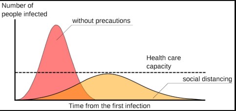
Flattening the curve ensures that the current hospital and healthcare workers aren’t over capacity. Viruses need a host to spread. The goal is to reduce the number of hosts for the virus. Some may not agree with social distancing or may not understand the intention. If you are one of the skeptics of this strategy, please just take a moment to view the diagram and go through the exercise of building an understanding and formulating your own insights based on the data available to us. The Washington Post presents a great depiction of flattening the curve in this demonstration, and the University of Washington utilizes existing data and advanced analytics to predict outcomes by country and state in these models.
Be a Data Leader
We can all help to stop the spread of misinformation and poor data. Take your newfound sense of curiosity and ability to ask further questions about data and share it with those who are close to you. Then encourage them to do the same. Proper education and information allows us all to take the proper precautions in this strange time to protect ourselves, our families, neighbors and coworkers, healthcare workers, retail workers, and more. When it comes to data, don’t settle for averages.
If there is one thing I have learned in my time with Zirous, and working within our data and analytics practice, it’s that we all need to be initially skeptical when we’re presented new data or information. Take the first step and develop an understanding. When we’re provided data and information, we need to ask further questions. We need to challenge the data and representation and ask ourselves, “What does this mean? What are they trying to represent? What is the goal? Does the data or infographic answer all my questions, or is there a better way?” With any new information and data, we need to fully understand it. Only when we can no longer ask questions, challenge the data, and look for new information are we able to feel confident in our answer.
Look to Each Other
These are some confusing and mysteriously dark times. My social media feeds have shown the darker side of people hoarding supplies, spreading misinformation, and putting others in danger. The upcoming time will be hard for everyone in one way or another and at varying levels of severity. This will eventually pass, and we’ll look back at this time with strong reflection. I am thankful to see a lot of good being done out there; it offers faith in our fellow man and has shown me that we cannot lose faith in each other. We see the good within each other with donations, helping our neighbors and friends in innovative ways, and leaning on each other in a time of crisis.
Related Posts


Comments (0)